 Building a successful company takes immense planning, innovative ideas and focused execution. As entrepreneurs, we tend to focus on the mechanics of what make our products and services unique. In other words, we focus on the code, business model and revenue. However, if we look at our everyday life, what is about the places we go and the environment we live in that we guard so fiercely? I tend to gravitate toward things that make me feel calm and invoke the best of my emotions. We curate items for our living and working space that remind us of those things we truly love.
I believe whole heartedly, that to create a great company you have to capture emotions in this same way. Color, is a primary way to accomplish building a space that is focused on the user. It’s the initial sensory attachment to your company and a powerful way to create confidence in your business. It happens within a split second, before a user reads a single word. This is the Brand Effect.
So how long have you spent on the color scheme of your business? Have you been so focused on launching early and often, that you haven’t really created a color scheme? If you have not, let me offer a few considerations that I personally use.
Don’t follow the crowd.
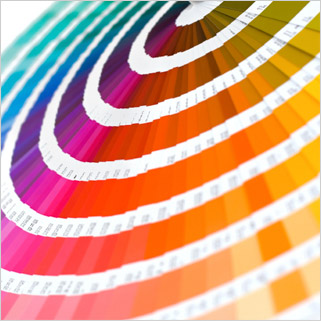
Industries have noticeable trends, from how they name themselves to how they carry out tasks. This is a trap that many new companies fall into because they are seeking acceptance, rather than redefining the service. Don’t fall into this trap with your design. Be bold in your color choices, select vibrant tones that cue positive emotions and don’t be afraid to be different.
Stay away from using black as a color.
Black is a role player that accentuates richness when used in balance. Conversely, too much whitespace creates a hollow sense. Find a balance. Reflect on places that have captured your imagination, the colors you saw and the atmosphere you felt. Put the passion you have for your business, into your business. One thing to always remember, the format and color scheme exists solely to support content.
Use colors that are warm and inviting.
I really like vibrant colors that have a flatter finish, rather than a shinny or glossy finish. This method allows user contributed video and images to be the focus and reduces visual confusion.
Selecting a color scheme is unique for each of us. Regardless of that method, take deliberate time to carefully do your research. The life of your business depends on it and as an entrepreneur, your personal satisfaction depends on it as well.
To get this new year started off right, checkout some great ideas on Design Seeds