First impressions are everything, especially for a start-up trying to court new users. A lot of start-ups believe it takes expensive design and brilliant imagery to get people to sign-up, when in reality none of that matters. All it takes to increase conversion rate is a solid headline, contrasting call to action button, detailed additional value, and social proof.
The Perfect Landing Page
There are four standard components to every landing page:
1) Headline and Value Proposition
2) Call to Action
3) Detailed Additional Value
4) Social Proof
Together, these components can make the perfect landing page – one that leaves a great first impression with new users and increases the conversion rate for those that sign up.
Looking at the landing page to the left, you’ll see the list perfectly executed. The headline is sweet, simple, and tells the user exactly what they’re getting into. The call to action button is loud, proud, and in stark contrast with the rest of the page. The additional value is thorough and convincing, and the social proof shows the value the product has provided to others. Let’s take a look at a few others.
RockMelt
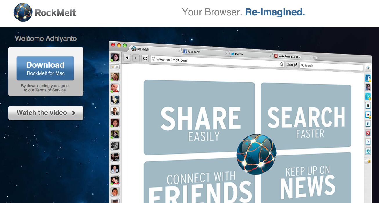
RockMelt (check it out) is a new social web browser looking to catch ground. It’s a great product once you use it, but it’s up to the landing page to get you to install it. How does it do?
Headline: “Your Browser. Re-Imagined.” Short? Yes. Sweet? Yes. To the point? No. That headline tells us absolutely nothing about the product. Although whimsical, it would be better if it told the user what is was – “The Social Browser”. Even something that simple tells us more than the current one.
Call to Action: The goal of this landing page is to get people to Connect with Facebook for an invitation. The placement and prominence of it is great, however it blends in. Your Call to Action needs to be in contrast with the rest of the page, so that it can’t be missed. Warm colors like Red and Orange typically do the trick.
Additional Value: Near non-existent. They have a video that tells the full story of the product, but you have to find and click a non-contrasting button to find it. This wouldn’t be a problem if they had text detailing the functionality on the landing page, but without that the landing page alone doesn’t give a new user any incentive to sign up unless they read about it elsewhere.
Social Proof: Re-Tweet and Like counters showcase the thousands of other people that believe in the product, however a line of text below would compound these efforts greatly – something like “Over 75,000 people have experienced the power of RockMelt. You should too!”
Grade: C
Blekko
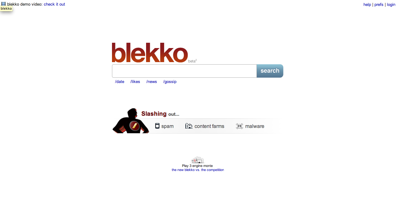
Blekko (check it out) is a new search engine that touts more accurate search results than Google based upon slashtag lists that better filter relevance. The goal of its landing page: To convince you to make it your default search destination. How’s it do? Well…
Headline: Nope
Call to Action: Not Really
Additional Value: Nope
Social Proof: Nope
They have the logo and the search bar. Although standard for search engines, this simply doesn’t cut it for a start-up. What is Blekko? What’s it do? How do I use slashtags? What makes it different than any other search engine? The landing page answers none of these things because there’s no headline, no additional value, and no social proof. As for the call to action button, there’s the search button, which I suppose can count. In order to truly understand what Blekko is, you have to scavenge the page to find the tiny links to videos and other explanatory literature that shows you what it’s all about.
As an underdog competitor, Blekko should be doing more than anyone to earn its stripes and prove to everyone that it returns better search results. Instead, it’s blending in. Therefore, unless its results are significantly different upon first search or press mentions thoroughly illustrate the full potential of the platform, users will most likely never return.
It could be drastically improved if they placed the video on the homepage to explain how slashtags work and added a tagline next to the logo telling people what value it was going to provide for them.
Grade: F
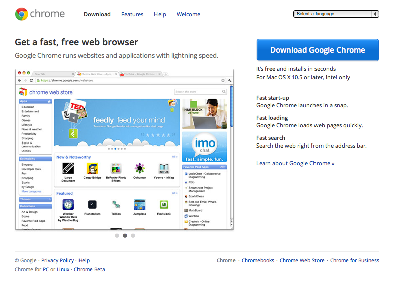
Google has the best landing pages on the market. They contain all the information a new user could ever need to know about the product and their purpose is clear – to get people to sign-up or download. For example, Google Chrome (check it out).
Headline: Check
Call to Action: Check
Additional Value: Check
Social Proof: Not Check, but they have a link to try the latest version, and the idea of sampling accomplishes the same thing.
Is there anything special about this page? No. Is the design innovative? No. Does it get the job done? Yes! This is what makes Google so successful. They focus on functionality as opposed to design. When a new user lands on this page, they aren’t distracted by colorful images or fancy text. They are faced with a blank slate that tells them everything they need to know, and then directs their attention to the task Google wants them to complete – the Download button.
That is what a landing page should look like. It doesn’t rely on hype from the press to convince people, it’s thorough, self-sustaining, and focused on converting new users into subscribers.
Grade: A+++
Conclusion
Start-ups don’t need expensive designers in order to create a solid landing page. All they need are the four things listed above, and they should have no problem getting new users to convert into loyal subscribers.


