The aesthetic of the web is changing. Images are getting bigger, video content is getting popular, and text is just part of the story rather than being used to tell the entire story on a webpage. User experience design agency Digital Telepathy is at the forefront of this new aesthetic that is moving away from traditional print layouts and toward telling stories with striking visual impact. Thanks to the rise in popularity of startups like Pinterest, users are warming up to the idea that websites don’t have to follow traditional page layout models.
You don’t have to be a seasoned web designer to give your website a facelift. All you need is a WordPress site and Digital Telepathy’s new plugin, SlideDeck2.
SlideDeck 2 exemplifies the company’s dedication to pushing the boundaries of visual possibilities by allowing web users to easily create content sliders for websites. Adding sliders to your site is an easy way to drive traffic to other content while presenting featured content in a unique way.
According to Jason Amunwa, product manager at Digital Telepathy, what makes SlideDeck 2 different from other content slider plugins is that the team focused on making it beautiful both inside and out.
“Plugins are popular, but the plugins are typically not designed very well. When you use most plugins, you are building out a form. We’ve made it beautiful on both the front end and back end. We’ve separated the content of the slider from the presentation.”
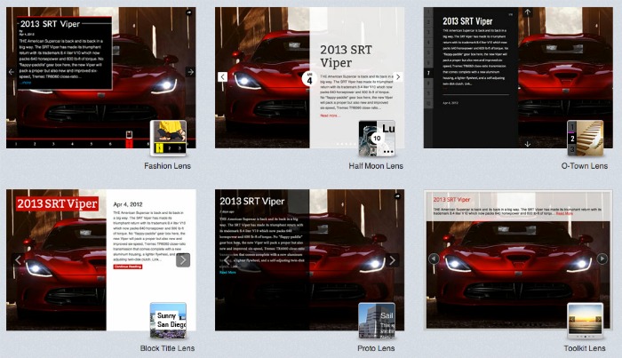
Amunwa likens this separation of content and structure to the relationship between CSS and HTML in web development. While HTML is the structure of a website, CSS is the decoration and design of the elements contained within an HTML document. The CSS document can be changed to give the site different looks, but the website elements remain the same. This is how SlideDeck 2 is designed, which is revolutionary in that it allows users to customize their content slider to give many different looks.
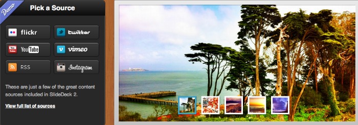
SlideDeck 2 is easy to use because it pulls in your existing content from sites like Flickr, Instagram, and Dribbble. This is significant because most existing content sliders make users enter content slide by slide, which can be quite time consuming.
“The homepage slider has a lot more potential for storytelling,” notes Amunwa. Storytelling is what Amunwa is passionate about, and he cites the anticipation of the Pinterest API as an example of how visual storytelling is becoming the language of the web. The mosaic design of Pinterest can be achieved with a dynamic layout plugin for jQuery called Masonry, which Amunwa says is ready for the mainstream. Companies like Zappos and Mulu are using Masonry to organize visual content in a mosaic layout.
Amunwa attributes the staggering growth of Pinterest as a sign that visual storytelling has an impact on the bottom line of e-commerce. “Pinterest is getting the attention of big e-commerce platforms like Shopify and Etsy,” he notes.
SlideDeck 2 is available right now, and SlideDeck 2.1 will be released in the coming weeks. SlideDeck 2.1 will allow you to create multimedia mashup slides, which increases the potential for media-rich storytelling. Publishers interested in beta testing SlideDeck 2.1 can contact Amunwa for access at jason@digital-telepathy.com.


