Your business — every business – needs a web presence capable of collecting info about existing and prospective customers, whether they are at a computer, trade show or simply walking by on the street carrying a tablet or smart phone. Even if the majority of your customer contact takes place outside the “cloud”, the good old Contact Us form is crucial for maintaining and growing your client base. It’s not just collecting the info that’s important though. It’s being able to use it, and two companies that have quickly become popular helping largely offline companies build simple forms to make use of their data growing their business are bizodo and Wufoo.
 Bizodo is the newer player, focusing on providing an easy online form builder enhanced with features to effectively manage the info once collected . New form submissions can be assigned to a team member with a CRM-type tool and/or sent an automated email to keep the conversation moving. The company is backed by an undisclosed amount of angel investment, but from the breadth of their development it seems they’re better funded than the typical duct tape products put out by bootstrappers.
Wufoo has built a large customer base solely as an online form builder, leaving users with a choice of what additional software to use for acting on collected data. They were recently acquired by SurveyMonkey, with obvious intentions of driving traffic to their research automation services. The synergy could be good or bad for users, depending on the extent to which integration options are stifled to increase conversion.
Both are effective tools for collecting info online. For the sake of this article, we’ll assume I’m seeking to build a lengthy job application form for my small business. (A simple Contact form would be too easy.) May the best tool win!
Round 1: Form Building Usability
Overview: Which software is easier to use for a non-programmer?
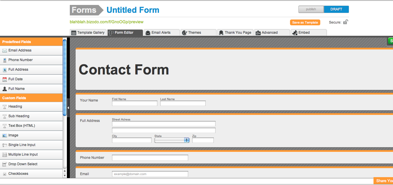
bizodo: Creating a bizodo account takes about 15 seconds, requiring just an email address and password, and a private labeled site (i.e. techli.bizodo.com) is generated automatically. You then choose whether to build a form from scratch using intuitive drag-and-drop tools or whether to select from one of over 100 templates. After some fussing, I ended up just selecting one of four available job application forms from their probably too-extensive gallery. Once in the advanced form builder to make customizations, I found it to have a rarely achieved balance of power and ease of use, as I usually feel either too boxed-in by limited options or overwhelmed by my lack of programming knowledge when taking on these types of tasks. Without much head scratching, I was able to set my email notifications, embed Google analytics code and, for those brave enough to be dangerous, even customize CSS. One of the usability points I most appreciated were the pre-made themes where I could transform the total look and feel of a form by choosing from an array of contemporarily designed styles that looked fitting for a wide range of businesses and application.

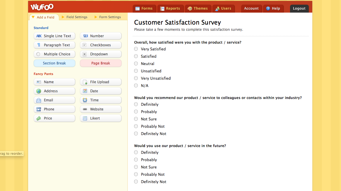
wufoo: Wufoo also allows you to create an account in seconds. I enjoyed their lighthearted messaging throughout the site, but the whole experience may be a bit too cute for an enterprise user. It took a few misguided minutes to get acclimated with their form builder, but it was distinctly easier to customize after a few initial missteps. One issue I encountered building a long job application form was being prompted to upgrade to a paid account to have more than 10 fields…apparently they’re into making money. The interface is clearly geared towards the ‘power user’ who requires ongoing form building and modifications for a wide range of needs like putting rules within a form, in which case the upgrade likely makes sense. The theme designer is intricate beyond what seems usable, allowing you modify the color or pattern for just about any section of a form, but it doesn’t do a complete style redesign like bizodo, pulling various elements together to be more visually appealing.
Winner: DRAW. Wufoo enabled me to make a more elaborate form once I knew what I was doing, but the end result from bizodo was what I would rather put up on my site, and it took less time to get there.
Round 2: Price
Overview: Which service gives you more bang for your buck?
bizodo: bizodo provides new users with three free forms and an unlimited number of fields, but limits you to 150 submissions per form. Paid plans start at 7.95 per month and do not limit your submissions, which is important for high volume sites where the allotted 10 forms is sufficient. Bizodo also comes with free project management, email marketing and contact/document sharing tools. The first user is free, and then it’s $5 for additional users. bizodo’s additional tools beyond form building are not as robust as the standalone software you might use for email marketing (MailChimp, SurveyMonkey…what’s with all the marcupials?!), CRM (ZoHo Saleforce) and Project Management (Basecamp), but they do provide the basic, essential features a smaller business would actually use, and this could lead to large time and money savings over subscribing to multiple integrated solutions.
wufoo: Wufoo offers 3 free forms with up to 100 submissions, but limits the amount of fields to 10, which was frustrating in my probably rare case of a long job application. Paid plans start at 14.95 a month and a max of 500 submissions. They do give additional users for free, but given there isn’t much else to do besides build forms, I don’t see much value in additional users.
.Winner: bizodo is a better buy IF you have simple forms, high volume submissions and will use all the other tools. Although, Wufoo may be necessary at a fair price for more complex, low volume forms.
Round 3: Additional Features
Overview: Let’s just look at all you get as a user.
bizodo: bizodo is really less of a form builder and more of a basic business software suite for appropriately basic needs. A few of their features could use some upgrades before taking on the likes of InfusionSoft, but they seem to be progressing nicely towards that sphere of usability. Adding a rule builder would be handy for complicated forms with conditional responses leading to a varied set of ongoing fields, but they definitely make it up with their themes, and according to their blog a rule builder is just around the corner. If you are currently using a basic newsletter software, project management tool and/or a CRM, there’s a chances you can use bizodo for all three, saving time and a pile of money.
wufoo: Wufoo has more polish with less bells and whistles. It is a powerful form builder, and its rule building is very cool if you have a complicated form. I don’t like that they charge you to use more than 10 fields to use this feature though, and they are slightly more expensive than bizodo without getting more to play with. Unless you need to create rules or only have a few minutes to put the form together, I just can’t justify paying more for wufoo.
Winner: bizodo hands down. You just get more, whether you use it or not.
Both services are impressive, allowing a programming novice to create visually appealing and effective online forms in literally three minutes with either. I started this Smackdown expecting Wufoo to win handily due to their reputation on head start, and the technology certainly didn’t let me down. However, bizodo surprised me with the value of their comparable form builder and the addition of integrated management tools. It’s a close call and largely depends on your needs, but bizodo takes the win. Hello Odo!


