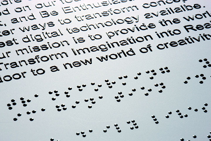
 Enhancing accessibility for people with disabilities is an insightful process. Often, solutions designed for a specific problem will improve life for everyone. Take automatic door openers, for example. Anyone with their hands full can push that button and enter a building more easily. Digital accessibility matters, too. Websites as well as buildings can comply with the Americans with Disabilities Act. In addition to website design, apps and devices are improving experiences for differently-abled people across the internet. Understanding Reality for Differently-Abled People First, I think it’s important to thoroughly understand the reality of the user. Good design solves problems, right? This is the heart of usability principles. In this case it is critical to understand that visual impairment is not one problem, but dozens of specific eye-sight conditions that affect individuals many ways. There is no one-size fits all solution because of the diversity of needs. And while visual impairment comes with inconveniences and obstacles, it can lead to greater understanding of the world and better art. Even without physical sight, the mind can construct and critique images. “The mind’s eye,” we call it. Check out the work and Zone Zero biography of photographer Evgen Bavcar. He’s lost both his eyes, but uses his sense of touch, portable lights and assistants to create images brimming with mystery. Clearly, there is more than one way to see the world. The Challenges of Color-Blindness Contrary to popular belief, most color blind people can see hues, but have trouble distinguishing between some of them. According to Color-Blindness.com, the human eye perceives colors with cones in the eye, each sensitive to Red, Green or Blue (the same colors screens use, interestingly). Consequently, depending on the combination of affected cones, color blindness will result in different visual reception in different people. Want to better understand the different types of color blindness? Check out their Color Blindness Simulator. The different types of color blindness make it a challenging problem to address. What works for a person might not work for another. Just yesterday, Mashable reported teenager Animesh Tripathi’s efforts to develop algorithms to adjust web content to common types of color blindness. His solution takes existing web filters to the next level because it increases the customization and could be applied across many technologies. WebAIM, an organization working to “empower organizations to make their web content accessible to people with disabilities,” suggests incorporating labels into pieces that use color to categorize information. This way, the color becomes an added layer rather than the key to understanding the concepts. Solutions For People With Low Or Reduced Vision For other vision impairments, such as low vision or legal blindness (a range from small limitations to no sight), technological advances offer an array of solutions. WebAIM describes screen readers, which convert on-screen text to synthesized speech. The user can skim headings, skip through links, hear text one line at a time or listen to content in its entirety. Additionally, screen readers can now speak to machines that use rising pins to create a real-time braille translation from the screen. Despite these advantages, WebAIM points out screen readers are not able to explain visual hierarchy or layout. And websites that include javascript that depends on mouse-overs or clicks put visually impaired users at a disadvantage. Mobiledia offers another example of a touch-screen device utilizing the sense of touch. Many phones and tablets vibrate to alert the user. Senseg’s E-Sense technology takes this several steps further by incorporating texture, which will create a digital braille system with an electric field hovering just above the screen’s surface. Beyond Braille With Mobile Devices MIT’s technology review recently reported this app designed to help blind people navigate indoor spaces. First, an individual places a directional line on the floor of an interior space. The app then uses the camera to scan for the line and lead the user through the space. Its simple execution means that the pathway can be customized by people most familiar with the building. Strategically placed QR codes offer another avenue to inform and guide people. Project Ray, on the other hand, has designed an entire mobile device around an eyes-free interface. Their website explains, “We knew that adapting existing smartphones with special features wasn’t enough to provide real independence, advanced communication and services to the worldwide community of blind and visually impaired people.” Rather, their device encompasses many needs and features in one convenient device. Screens Come To Their Other Senses In addition to helping people with visual impairments, these solutions expand the very nature of mobile devices and programs. Developers are thinking beyond the visual experience. This will lead to more innovative and imaginative solutions. Not everyone is a visual learner. Until recently, however, devices have leaned most heavily on these senses. Imagine the possibilities of including touch and kinesthetic experiences to apps. ———————— Photo Credit: Flickr
A New Vision Of The Web
By Techli
4 marzo, 2014


