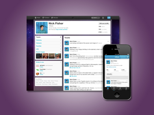
This afternoon Twitter announced the launch of its newly designed user interface along with version 4.0 of its mobile app. The new design aims to create a simpler experience for current and new Twitter users with the goals of following what you care about, connecting with others, and discovering something new. According Twitter’s blog the new design will be rolled out over the next several weeks. The design features four distinct features: Home, Connect, Discover, and Me.
- The ‘Home’ feature will be a redesigned user dashboard that at first glance appears to offer a more intuitive user experience.
- The ‘Connect ‘ feature aims to consolidate all of your interactions on Twitter. This is where you will find new follows, mentions, retweets, and users who have favorited your tweets.
- The ‘Discover’ feature is meant to help you make connections around your interests by offering recommendations and various categories of your interests.
- The ‘Me’ feature is Twitter’s completely redesigned user profile.
Stayed tuned for a more detailed review of this newly designed Twitter interface and mobile application.


