Twitter’s first bird logo cost less than a beer at some Silicon Valley drinking establishments. It’s hard to put a price on its latest design, but it was masterminded by classically trained creative director Doug Bowman – who the company hired away from Google, at no doubt considerable expense, in 2009.
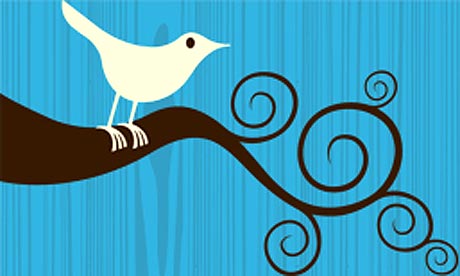
The stock image on which Twitter’s first bird logo was based was created by graphic designer Simon Oxley. Though Twitter paid no more than $15 dollars for non-exclusive rights to the image – of which Oxley might have received as much as $6 – the iconic image has been purchased many hundreds of times since, earning him a bit more in the years since.
It seems that whatever Twitter offered Bowman financially was only one part of his decision to leave Google, where he says he was stifled by an engineering culture that every decision needed to be demonstrably, analytically sound.
“I had a recent debate over whether a border should be 3, 4 or 5 pixels wide, and was asked to prove my case,” Bowman wrote at the time of his departure. “I can’t operate in an environment like that.”
That doesn’t appear to have been a problem for the new design, the metaphorical content of which has is detailed in a spirited company blog post, which has already been called “pretentious.”
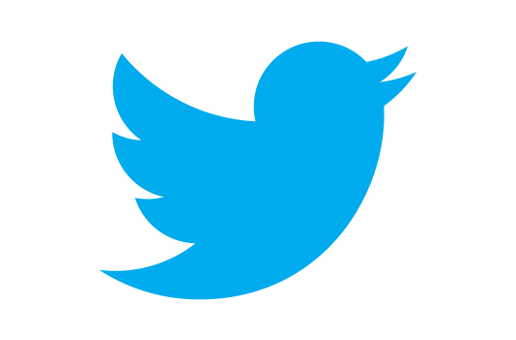
“Our new bird grows out of love for ornithology, design within creative constraints, and simple geometry,” Bowman wrote. “This bird is crafted purely from three sets of overlapping circles – similar to how your networks, interests and ideas connect and intersect with peers and friends.”
Unlike the last bird logo, which gazed horizontally, Bowman’s latest lifts its beak as if preparing for an ascent. It also does away with the curious tuft of feathers – or anthropomorphized hair – sported by the previous iteration, which Bowman also designed.
Bowman said that while the design process was inspired by hummingbirds, he believes the final design’s silhouette is more akin to a mountain bluebird.
All logos: Twitter
View Comments (5)
Ornithologist evaluation of the new #twitter logo. Pretentious and "clearly flightless" http://www.quora.com/Ornithology/What-do-ornithologists-think-of-the-new-Twitter-logo
@CaseMorton That's dark. Nice find.
I like the new one. I judge icons these days based heavily on how well they scale down to a twitter icon size. Their first bird would not pass that test.
@EricaDaly Imagine how embarrassing it would be for them if it didn't.
Facinating article about the origins of the logo. Its a perfect example of the style logos need to adhere to in today's branding market.