When you are ready to launch a new product, how do you know that you are charging your new users the correct price? Maybe you decided pricing based on what you would pay for a similar product, or maybe you are charging just under what your competitors are charging. Even if your hunches are correct and you do get a few paying users, how do you know if they would potentially pay you more for the same product? If these questions have you already doubting the pricing structure of your web app, good. Pricing strategy is not supposed to be easy. In fact, entire semesters in business school can be devoted to the study of pricing strategy.
When it comes to putting a price on their blood, sweat, and tears, entrepreneurs have a hard time. Choosing the optimal price plans for both your business and your users requires distance from your product. Instead of relying on a combination of market research and your gut feeling, here are a few proven strategies that will help you price your web app:
Keep It Simple
If a customer can’t understand your pricing above the fold, you’ve already lost them. Users go to the pricing page to see how much your product costs, not because they want to read 4 paragraphs of text about your business value proposition. Save that for the business plan, and just be upfront about the numbers.
For example, this afternoon I was checking out a cool new startup that was just accepted to the new class of the Portland Seed Fund. Beeminder is web app that helps you to set and achieve your goals. The app is free to use – until your fail at your goal. Then you have to pay. Since I am trying to work on my procrastination problem, I wanted to check out how much it would cost if I failed at my goals (sad but true). What I found on the pricing page was a long explanation with lots of text and a few graphs. After getting halfway down the page, I still wasn’t sure what the price would be if I became a user. Since I am in the startup world, I’m patient with new companies while they iron out the kinks.
I really like the idea, so I sent them a tweet with a pricing suggestion.
They replied:
To the folks at Beeminder: please keep it simple. Your customer base is “unmotivated people”. They certainly won’t be motivated to read your complicated pricing structure.
Use Visuals
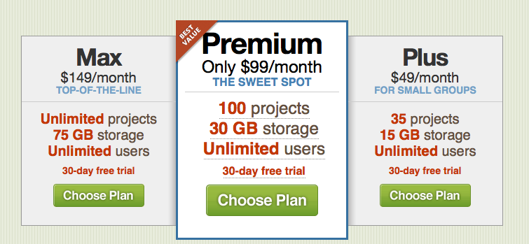
Design your pricing page to encourage behavior. Use color and visual queues to point your users toward the best value for both your company and them. Typically, this is the middle option. It has more features than a basic plan, but it doesn’t have all of the bells and whistles that premium users demand. If some features require a text-based explanation, try using bullet points or a hover effect for further explanation without cluttering the page.
A great example of a pricing page using visual queues is the 37Signals product suite. This is an example of the pricing page from their Basecamp product:
A/B Test (But Not For Too Long!)
It’s fine to test pricing options during your beta, or during the first week of your launch. But don’t fall into the trap of waiting to collect a large amount of user data before you make a decision. Although it’s tempting, you run the risk of angering users who discover that they are paying more than other users for the same product. When someone publishes the price of your product on social media or on a blog, your A/B test is over.
Charge For Usage
If you are having a hard time deciding what your pricing tiers should be, consider charging for usage. Consider setting a base price and charge incrementally. The more people use, the more they pay. It really is that easy.
Social helpdesk app Desk combines a freemium service with usage pricing. The first support rep is free, but you can add part-time agents to your plan that can use the app for $1 per hour.
To Freemium Or Not To Freemium?
This is a hotly debated topic, with both sides having valid points. The answer depends upon your funding. If you are a bootstrapped startup, it’s better to generate revenue from the get go so that you can reinvest in your business. If you are backed by venture capitalists or angel investors, you have the option to go after a massive amount of users via a freemium model, then monetizing those free users.
Evernote has successfully monetized free users by offering add-on functions for power users. Here are the benefits of their upgrade package. Notice that “ad free” is one of the selling points of the paid membership.
Freemium models have a notoriously low conversion rate to paying subscribers, so make sure that you have enough add-on features that you can potentially monetize before you consider this strategy.
Knock A Few Bucks Off Or Add Features For Referrals
Encourage your users to do your marketing for you by providing incentives for them if they bring in new users. When you automate customer acquisition, pass the savings along by offering one of two options: either discount the next month’s charge, or upgrade the user to the next pricing tier for free.
Dropbox successfully utilized this model by offering additional storage to users who recruited new signups.
Your pricing strategy must be optimized to both benefit your business and attract new users. Don’t just pick a pricing model out of thin air. Use the pricing models of successful companies as your guide.


View Comments (1)
Hmm... so you make a comment about being confused with their pricing, and they reply in foreign language... no further questions your honor.Â