 What one tech startup website is set up really well to optimize conversions and what specific details about the website make it work so well? The following answers are provided by the Young Entrepreneur Council (YEC), an invite-only organization comprised of the world’s most promising young entrepreneurs. In partnership with Citi, the YEC recently launched #StartupLab, a free virtual mentorship program that helps millions of entrepreneurs start and grow businesses via live video chats, an expert content library and email lessons. 1. Pocket
  “When you find something you want to view later, put it in Pocket.” It’s simple, it’s easy, and it’s free.Pocket’s value proposition and call to action are front and center, easily encouraging sign-ups. The UI is clean, and the site provides everything you need to know in a concise manner. In case you can’t tell, I’m a big fan! – Arjun Arora, ReTargeter 2. Dropbox
  Dropbox is dead simple. There is nothing in the UI except what needs to be there. It has achieved simplicity without appearing weak. – Danny Boice, Speek 3. NationBuilder
  I really love what they’re doing over at NationBuilder. For starters, the brand says it all. They truly have a mission that relays to prospects that they care about something bigger than all of us. On the site, the way they segment their client categories is genius. Also, by not leading with price, they get clients in the door with a free trial and upsell them later. – Logan Lenz, Endagon 4. Unbounce
  Unbounce allows you to build, publish and A/B test landing pages to increase the ROI of your marketing campaigns. Build a page. Publish it. Test and optimize it for conversions. Pretty simple. – Brett Farmiloe, Digital Marketing Agency 5. Magoosh
  Magoosh is a test prep startup that offers GRE and GMAT products. They have a few characteristics that lead to a high optimization. Every page has a clear call to action. There is a free trial with a hearty amount of material, so you can see the value of prepping through Magoosh. And they highlight real customer testimonials, showing how the product has had a true impact. – Aaron Schwartz, Modify Watches 6. CareLogger
  Dan McGrady launched the website and mobile app CareLogger, which is designed to track diabetes and blood sugar levels. He was able to improve conversion rates by 72 percent simply by adjusting its headline, changing the color of the sign-up button and adjusting the text included in the button. – Andrew Schrage, Money Crashers Personal Finance 7. Optimizely
  Optimizely has a great live demo system: you put in the address of your site, and it will automatically load your page and show you an example of what an A/B test would look like in its system with zero work on your end. It’s a really impactful experience with minimal effort required. – Robert J. Moore, RJMetrics 8. Netflix
  Netflix has a perfect homepage. There is a clear call-to-action oriented around a free trial to entice visitors to act now, and users can do next to nothing on the site except sign up for the free trial. The result is one of the best converting sites on the Internet. – Chuck Cohn, Varsity Tutors 9. WorkFlowy
  WorkFlowy’s landing page is incredibly simple and gets straight to the point. It has a simple call to action, clean design and a (seemingly) endless scrolling testimonial list under the opt-in for people who are on the fence. Bonus: it’s free, and it’s great software! – Patrick Conley, Automation Heroes 10. Mint
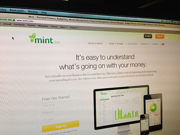
  Mint has a compelling headline, a clear call to action that stands out and social proof with quotes from top news sources such as The New York Times and The Wall Street Journal. – Josh Weiss, Bluegala 11. Everlane
  Everlane is actually set up perfectly. It changes its content often, and it features specific products by Everlane. Those products are only available for a certain amount of time, and then they’re gone. That’s it. It’s a simple UX. You only have a couple choices. You can go on, make your choice, buy it, and that’s it. – Rameet Chawla, Fueled 12. Nest
  First off, making home heating sexy is no easy feat, so props there. But the Nest site is also cleverly designed. It’s easy to navigate. The info and benefits are crystal clear. The “buy” option is easy to find and includes trusted retailers, and the reviews and news add to my confidence. The bases are all covered well. Check it out, and try telling me you’re not excited about thermostats now. – Nicolas Gremion, Free-eBooks.com 13. LendUp
  Launched in 2012, LendUp is an alternative to payday lenders. Its features promise to convert traffic well. A prominent value proposition — build credit, not debt — and a bold call to action greet visitors on the home page. Scroll down to find testimonials and links to coverage by national media. Educational articles and the company’s physical address further strengthen customer confidence. – Jay Wu, A Forever Recovery
13 Best Tech Startup Websites for Optimizing Conversions
By Techli
18 julio, 2013


